17 April 2025
Alerts in iOS: Simple but Tricky
Alerts are a standard UI element in iOS apps, used to inform users or request decisions. Though they seem simple, alerts involve many subtle guidelines around button order, roles, and colors. Mistakes here can confuse users. In this article, we’ll break down the correct use of alerts, highlight common pitfalls, and focus on Apple’s Human Interface Guidelines (HIG) to help you design clear and safe interfaces.
This article is relevant for iOS 18 and uses the latest SwiftUI API for alerts. If you are supporting older versions or using UIKit, some details may differ, but the general principles remain the same.
Alert vs ActionSheet
Before we dive into alerts, let’s talk about ActionSheet and where to use it instead of Alert. An action sheet is a UI element that presents a set of choices related to an action the user has started. According to the Human Interface Guidelines (HIG):
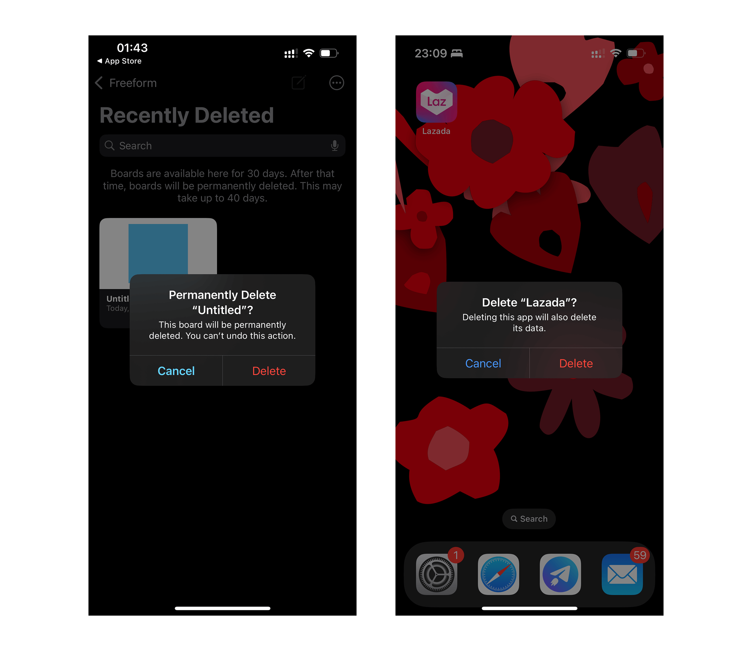
Use an action sheet — not an alert — to offer choices related to an intentional action. For example, when people cancel the Mail message they’re editing, an action sheet provides three choices: delete the edits (or the entire draft), save the draft, or return to editing. Although an alert can also help people confirm or cancel an action that has destructive consequences, it doesn’t provide additional choices related to the action. More importantly, an alert is usually unexpected, generally telling people about a problem or a change in the current situation that might require them to act.
It seems obvious, but even Apple is not always consistent. For example, when you delete a note in the Notes app, you see an action sheet, but when you delete a reminder in the Reminders app, you see an alert. Why?
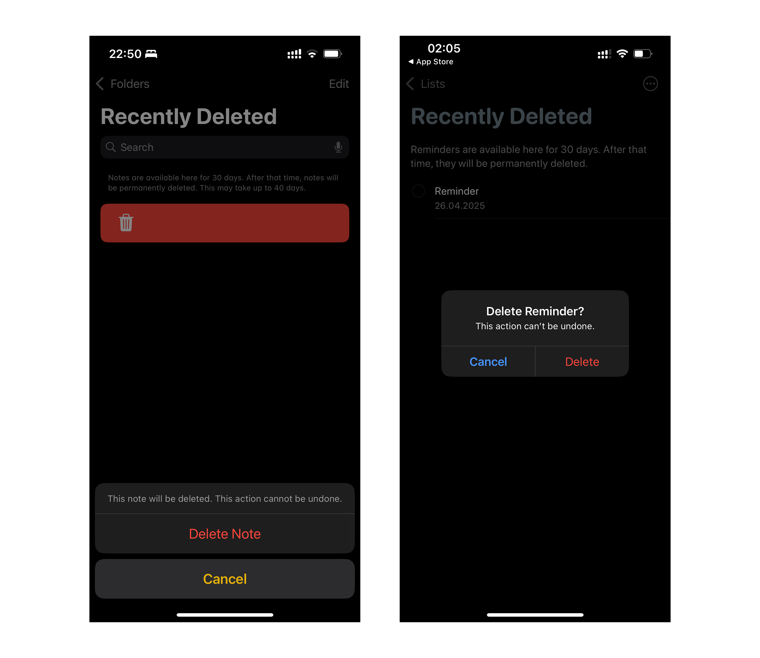
According to HIG, in this case, an alert would be more appropriate, because the user is being warned about a destructive action that cannot be undone. This highlights the importance of understanding the intent behind each component and choosing the right one for your scenario.
Diving into Alert
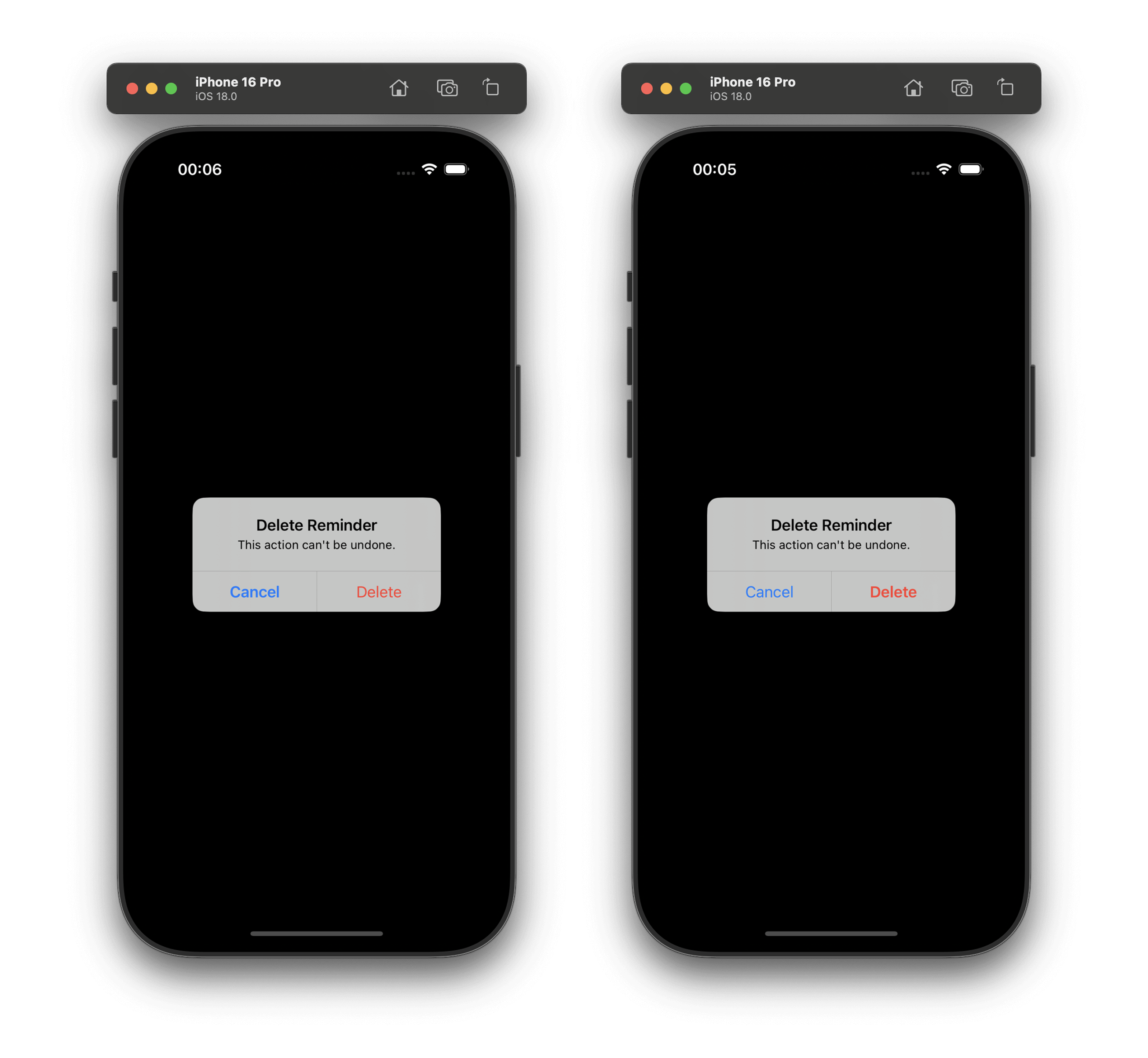
Since we decided that an alert is the right choice in the previous example, let’s see how to use it correctly and what options we have. We will not talk about the title and message, as they are straightforward. Instead, let’s focus on the buttons, their placement, and style.
In the example above, the destructive button “Delete” is on the right, and the cancel button is on the left. This is the current HIG recommendation:
Place buttons where people expect. In general, place the button people are most likely to choose on the trailing side in a row of buttons. Always place the default button on the trailing side of a row. Cancel buttons are typically on the leading side of a row.
You don’t need to worry about the button order — just assign the correct role (such as .cancel or .destructive) to each button, and SwiftUI will automatically arrange them according to the latest HIG. This not only simplifies your code, but also guarantees a consistent and native experience for your users.
.alert("Delete Reminder") {
    Button("Cancel", role: .cancel) {}
    Button("Delete", role: .destructive) {}
} message: {
    Text("This action can't be undone.")
}
Even better, you do not need to add the cancel button explicitly. The system will add it for you, making your code even cleaner:
.alert("Delete Reminder") {
    Button("Delete", role: .destructive) {}
} message: {
    Text("This action can't be undone.")
}
But it was not always like this. In the past, HIG said the opposite:
In a two-button alert that proposes a potentially risky action, the button that cancels the action should be on the right and light-colored. In a two-button alert that proposes a benign action that people are likely to want, the button that cancels the action should be on the left and dark-colored.
I think this is why you can still find alerts in iOS where the button order is different.
Apple made it easier for developers, and forgot about themself.
Should the Destructive Button Always Be Red?
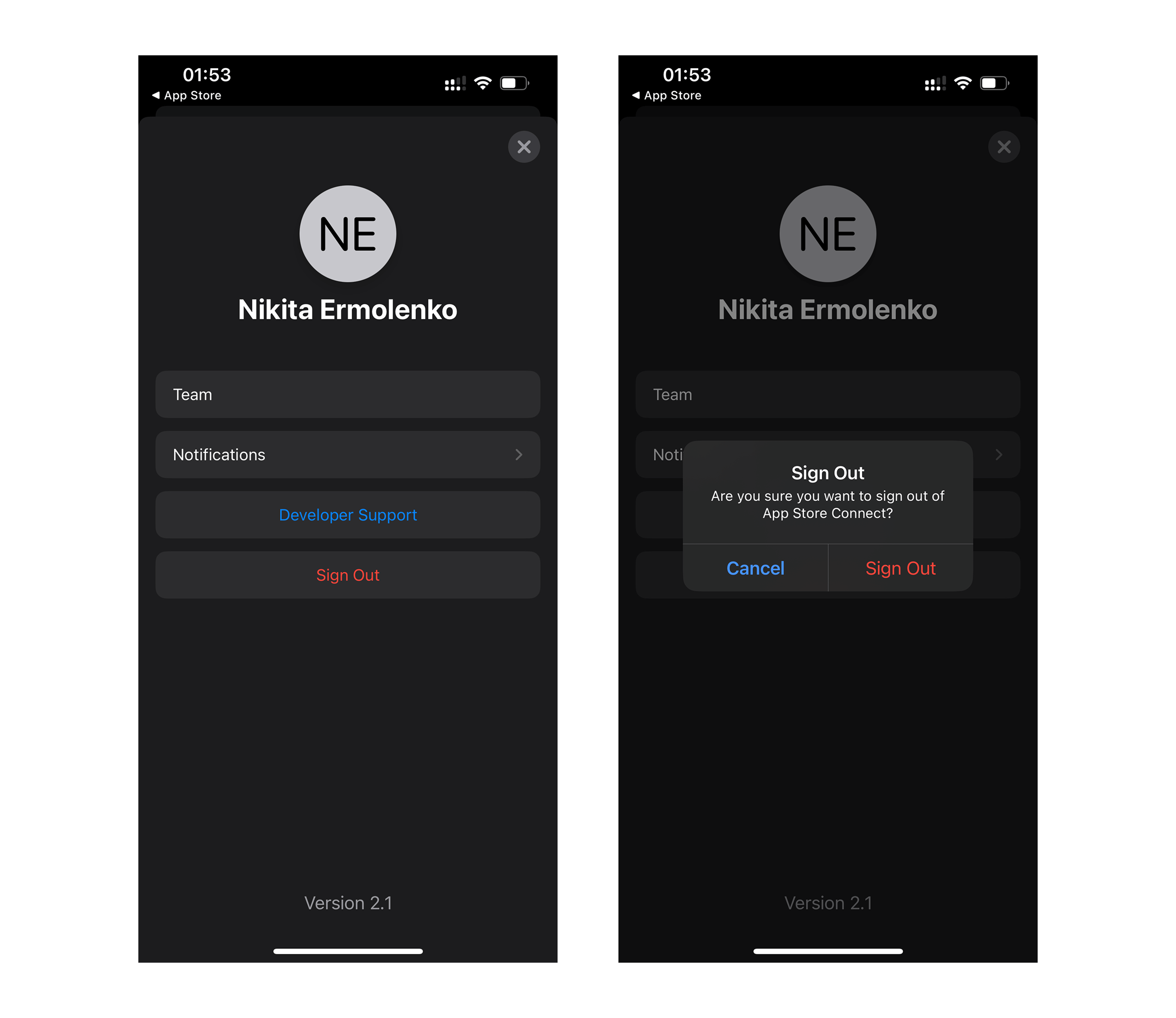
Use the destructive style to identify a button that performs a destructive action people didn’t deliberately choose. For example, when people deliberately choose a destructive action — such as Empty Trash — the resulting alert doesn’t apply the destructive style to the Empty Trash button because the button performs the person’s original intent. In this scenario, the convenience of pressing Return to confirm the deliberately chosen Empty Trash action outweighs the benefit of reaffirming that the button is destructive. In contrast, people appreciate an alert that draws their attention to a button that can perform a destructive action they didn’t originally intend.
In simple words: If the user already chose a destructive action (for example, pressed a red “Sign Out” button in a list), the confirmation button in the alert does not need to be red again. It can be blue, because the user already made a conscious choice.
But if the alert is warning about a destructive action that the user did not choose directly, the destructive button should be red to draw attention. This subtle distinction helps prevent accidental data loss while keeping the interface clean.
If I understand HIG correctly, in these scenarios the button should be blue. Always consider the user’s intent and the context of the action when choosing button styles.
The Cancel Button is Bold?
You may have noticed that the “Cancel” button above is bold. Apple made this change in iOS 8.3. HIG recommends making the “Cancel” button the bold button in an alert with a destructive action. This makes the safe option more visible and reduces the risk of accidentally choosing the destructive action.
However, it’s worth noting that even in Apple’s own examples (again), the Cancel button is not always bolded. This inconsistency can be confusing, and it shows that even Apple sometimes deviates from its own guidelines.
Sometimes (I hope never), you may want to do the opposite — not just remove the bold emphasis from “Cancel”, but actually make the destructive button stand out even more. For example, if you want to draw extra attention to a destructive action, you can use .keyboardShortcut(.defaultAction) on the destructive button.
Button("Delete Reminder", role: .destructive) {}
    .keyboardShortcut(.defaultAction)

Button("Cancel", role: .cancel) {}
This will make the destructive button bold, increasing its prominence in the alert. Cancel button will not be bold anymore:
‼️ Use this carefully, as making the destructive action more noticeable can increase the risk of accidental data loss.
But What Does Default Action Mean?
As the name suggests, you can trigger the action using a keyboard shortcut. defaultAction means this is the default button in your OS. Since SwiftUI works on different platforms, the system will decide what this means. On iOS, keyboard shortcuts are not very useful, unless you use an iPad with a keyboard. It can also be helpful for developers to use the keyboard in the simulator.
By default, the system treats destructive buttons as default actions in alerts with two buttons, so you usually don’t need to add .keyboardShortcut(.defaultAction) explicitly:
However, in alerts with three or more buttons (one of which is destructive), no button is set as the default. In such cases, you can assign .keyboardShortcut(.defaultAction), this approach encourages users to pay closer attention before making a choice.
If you want to encourage people to read an alert and not just automatically press ↩ to dismiss it, avoid making any button the default button.
Button("Delete", role: .destructive) {}
    .keyboardShortcut(.defaultAction)
Button("Cancel", role: .cancel) {}
Button("Info") {}
In alerts with a single button — regardless of its role — pressing the default key (↩) will dismiss the alert and trigger that button’s action:
alert {
    Button("OK") {} // default action
}

alert {
    Button("Delete", role: .destructive) {} // default action
}

alert {
    Button("Cancel", role: .cancel) {} // default action
}
In the context of alert example, this modifier also makes the button text bold. This visual cue helps users quickly identify the primary action, but use it thoughtfully to avoid confusion.
Conclusion
- Always use the correct component: Alert for unexpected warnings, ActionSheet for intentional choices.
- Assign proper roles to buttons (
.cancel,.destructive) and let the system handle their order and style. - Destructive buttons do not always need to be red — consider the user’s intent.
- Follow the Human Interface Guidelines, but remember that even Apple sometimes makes exceptions — strive for clarity and user safety in your own apps.
By paying attention to these details, you can create alerts that are not only functional but also intuitive and safe for your users. Thoughtful design and thorough testing will help your app stand out and provide a better experience for everyone.
References
© 2024 Nikita Ermolenko. Some rights reserved.