25 February 2024
Making Customizable SwiftUI Components
In this article, we’re going to explore different ways of creating customizable components in SwifUI.
Many of us have encountered loader indicators in our work, making it a familiar starting point. We’ll begin with the most basic component and progressively enhance its flexibility.
Imagine a basic circle that fills up as the progress increases. This is our starting point:
struct LoaderView: View {

    let progress: Double
    @State private var degree: Double = 0

    var body: some View {
        Circle()
            .trim(from: 0.0, to: progress)
            .stroke(Color.red, style: StrokeStyle(lineWidth: 8.0, lineCap: .round))
            .rotationEffect(.degrees(degree))
            .animation(Animation.linear(duration: 1).repeatForever(autoreverses: false), value: degree)
            .onAppear {
                degree = 360
            }
            .frame(width: 80, height: 80)
    }
}
It spins and spins all the time, nothing more.

Progress color
Let’s start the improvements by making the progress color adjustable. Initially, you might consider passing a tint color directly into the initializer:
LoaderView(progress: 0.6, tintColor: .purple)
However, having numerous configuration parameters can get messy eventually, so I’d suggest to use a more SwiftUI approach - using the tint modifier:
LoaderView(progress: 0.6)
    .tint(.purple)
If you are used to using environments, you may want to consider using @Environment(\.tint).
But the problem it doesn’t exist (technically it’s internal), so we can’t access it directly.
struct LoaderView_Env: View {
    // Error: 'tint' is inaccessible due to 'internal' protection level
    @Environment(\.tint) var tint
}
By looking at the stroke signature we can see it accepts ShapeStyle protocol as a first argument, not a specific color as we might though:
func stroke<S>(_ content: S, style: StrokeStyle, antialiased: Bool) -> ... where S : ShapeStyle
The nice thing for us is that SwiftUI provides TintShapeStyle that conforms that protocol and has an underlying access to the passed tint color.
Thus, we don’t need an environment at all, just pass .tint as an argument:
.stroke(.tint, style: StrokeStyle(lineWidth: 8.0, lineCap: .round))
NOTE: the similar approach can be achieved for .foreground by using ForegroundStyle.
Loader size
Now the color is configured, let’s make the loader view flexible in size.
With the current implementation it has a fixed size 80x80. To adjust this, we set the ideal size - similar to intrinsicContentSize in UIKit:
Circle()
    ...
    .frame(idealWidth: 80, idealHeight: 80)
By default our loader grows as long as a parent allows, but if we want to have a default size - we apply fixedSize modifier:
struct ContentView: View {
    var body: some View {
        HStack(spacing: 20) {
            LoaderView(progress: 0.6)
                .fixedSize()

            LoaderView(progress: 0.6)
        }
    }
}

You can experiment with the Color the same way - it expands as much as possible and the fixedSize makes tiny.
If you’re not familiar with these modifiers, I’d recommend to read this article about SwiftUI Layout.
So far so good:
struct LoaderView: View {

    let progress: Double
    @State private var degree: Double = 0

    var body: some View {
        Circle()
            .trim(from: 0.0, to: progress)
            .stroke(.tint, style: StrokeStyle(lineWidth: 8.0, lineCap: .round))
            .rotationEffect(.degrees(degree))
            .animation(Animation.linear(duration: 1).repeatForever(autoreverses: false), value: degree)
            .onAppear {
                degree = 360
            }
            .frame(idealWidth: 80, idealHeight: 80)
    }
}
Styling
It’s time to add different styling options - for simplicity, we’ll consider two variants:
- Primary (80x80 size, purple progress color, and progress value inside)
- Secondary (40x40, pink, without any progress text)
In a simple scenario you’d just pass a style directly to an initializer:
LoaderView(style: .primary)
and applied different configurations for each style by having many switch and if conditions. Probably in most cases it’s not a big deal and doesn’t look messy, but sometimes it complicates the code a lot that it’s better to use the approach SwiftUI uses a lot (style protocol).
First step is creating a LoaderStyle and LoaderStyleConfiguration. Different styles should implement this protocol and use the provided values by configuration:
protocol LoaderStyle: DynamicProperty {
    typealias Configuration = LoaderStyleConfiguration
    associatedtype Body: View

    @ViewBuilder func makeBody(configuration: Configuration) -> Body
}
It’s up to you how many information your configuration’s needed. For simplicity the progress and the loader bar will be enough for us:
struct LoaderStyleConfiguration {
    struct Indicator: View {
        public let body: AnyView
    }

    let progress: Double
    let loadingIndicator: Indicator

    init(progress: Double, @ViewBuilder loadingIndicator: @escaping () -> some View) {
        self.progress = progress
        self.loadingIndicator = Indicator(body: AnyView(loadingIndicator()))
    }
}
Then we need to define a custom EnvironmentKey with the default primary option for passing a needed style to our component:
struct LoaderStyleEnvironmentKey: EnvironmentKey {
    static var defaultValue: any LoaderStyle = PrimaryLoaderStyle()
}

extension EnvironmentValues {
    var loaderStyle: any LoaderStyle {
        get { self[LoaderStyleEnvironmentKey.self] }
        set { self[LoaderStyleEnvironmentKey.self] = newValue }
    }
}

extension View {
    func loaderStyle(_ style: any LoaderStyle) -> some View {
        environment(\.loaderStyle, style)
    }
}
Finally, two implementations of our styles:
struct PrimaryLoaderStyle: LoaderStyle {
    func makeBody(configuration: Configuration) -> some View {
        configuration.loadingIndicator
            .tint(Color.purple)
            .frame(width: 80, height: 80)
            .overlay {
                Text(String(Int(configuration.progress * 100)) + "%")
                    .font(.subheadline)
                    .foregroundStyle(Color.secondary)
            }
    }
}

struct SecondaryLoaderStyle: LoaderStyle {
    func makeBody(configuration: Configuration) -> some View {
        configuration.loadingIndicator
            .tint(Color.red)
            .frame(width: 40, height: 40)
    }
}
I also highly recommend to add some readability improvements by adding convenience getters for our styles:
extension LoaderStyle where Self == PrimaryLoaderStyle {
    static var primary: Self {
        PrimaryLoaderStyle()
    }
}

extension LoaderStyle where Self == SecondaryLoaderStyle {
    static var secondary: Self {
        SecondaryLoaderStyle()
    }
}
To make it all works we need to adjust our main component as well. Create a configuration with a progress and loading indicator and pass it to the loader style:
struct LoaderView: View {

    let progress: Double

    @State private var degree: Double = 0
    @Environment(\.loaderStyle) private var loaderStyle

    var body: some View {
        let configuration = LoaderStyleConfiguration(
            progress: progress,
            loadingIndicator: {
                Circle()
                    .trim(from: 0.0, to: progress)
                    .stroke(.tint, style: StrokeStyle(lineWidth: 8.0, lineCap: .round))
                    .rotationEffect(.degrees(degree))
                    .animation(Animation.linear(duration: 1).repeatForever(autoreverses: false), value: degree)
                    .frame(idealWidth: 80, idealHeight: 80)
                    .onAppear {
                        degree = 360
                    }
            }
        )
        let resolvedView = loaderStyle.makeBody(configuration: configuration)
        AnyView(resolvedView)
    }
}
For a more detailed guide into custom view styles I recommend to read this article.
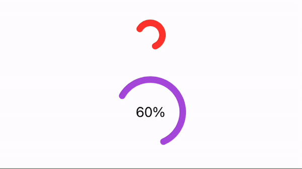
Finally we can use it as follows:
VStack(spacing: 40) {
    LoaderView(progress: 0.6)
        .loaderStyle(.secondary)

    LoaderView(progress: 0.6)
        .loaderStyle(.primary)
}
Sure, you don’t have to stick to all the rules for every single component. So, just use this know-how wisely and don’t make your code more complicated than it needs to be. 😉
© 2024 Nikita Ermolenko. Some rights reserved.