22 January 2021
On a way to great accessibility with Dynamic Type
Sir, put off your monocle, today we will talk about Dynamic Type!
Accessibility plays a crucial role in all apps by far, so when you design an app make sure to keep text sizes and layout in mind for clarity and readability.
In a nutshell, Dynamic Type lets you define a desired text size in iOS user settings and use it across apps that support it. Supporting this feature not only improves the user’s experience but also trains developers to write code for more dynamic interfaces - for instance, plenty of localization options.
Today I will try to cover the following topics:
- Why it’s so important to pay attention adapting Dynamic Type
- Find out the best accessibility practices
- UI adaptation for different text sizes
- Check the available API for developers
Without further ado, let’s dive into the article!
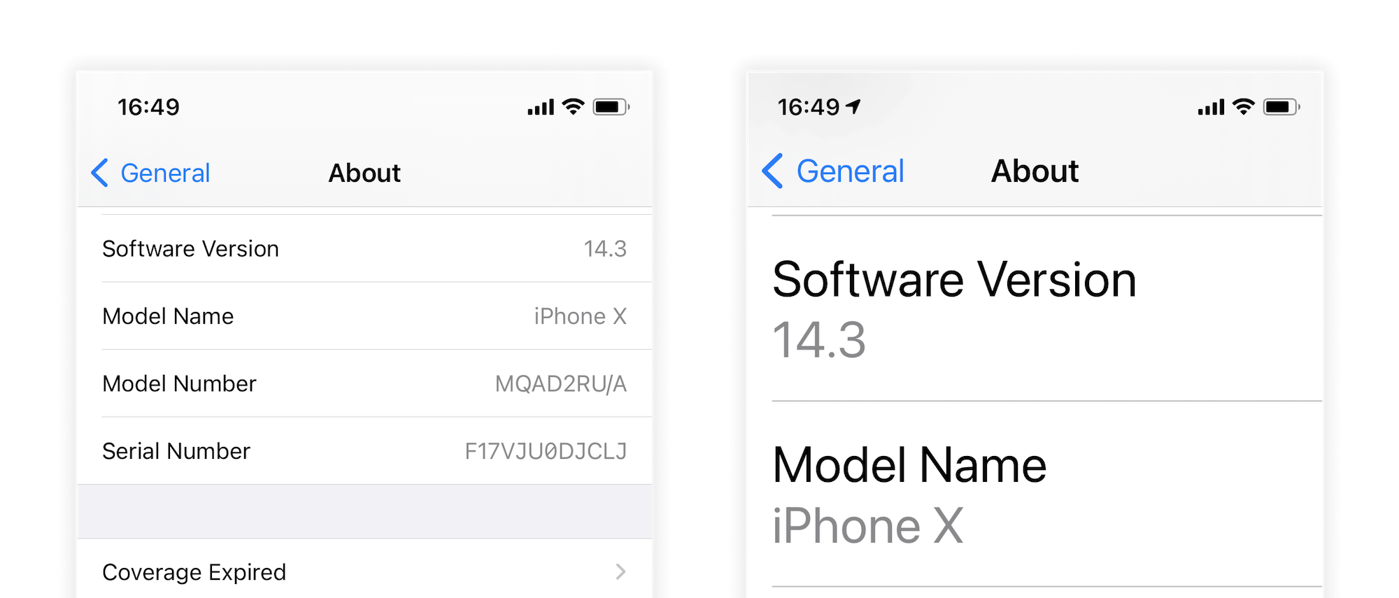
Developers write apps for users obviously and about 25 percent of them use non-default text sizes. I was really surprised seeing these statistics reading the PSPDFKit blog. And consider the fact Apple has moved the “Accessibility” settings one level up from the “General” tab in iOS 14, I decided to add metrics in my current app and got the similiar results:

Just for clarification, the Accessibility fonts is an additional group with even larger text sizes for users with accessibility needs. Apple’s apps is a great example of adapting these types of fonts. They do not only change text size, but apply some layout changes - you will see it later.
Best practices
Now knowing why it’s important to pay attention adapting Dynamic Type, let’s summarize the most important practices in my opinion:
-
Apple in its HIG recommends setting the minimum size for Body text to be 17pt.
-
As font size increases, avoid truncating text. It’s best when people can simply scroll to see the same amount of text that’s visible at the default font size. Don’t truncate text unless people can open a separate view to read the rest of the content.
-
Keep in mind the Accessibility fonts. Fonts with even larger text sizes usually requires layout changes.
-
Increase the size of meaningful glyphs as font size increases. If you use glyphs to communicate important information, make sure the glyphs are easy to view at larger font sizes, too.
-
Maintain a consistent information hierarchy regardless of the user’s font size choice. For example, keep primary elements towards the top of the screen even when the font size is very large, so that people don’t lose track of these elements.
-
Make sure custom fonts are legible. Custom typefaces can sometimes be difficult to read. Unless your app has a compelling need for a custom font, such as for branding purposes or to create an immersive gaming experience, it’s usually best to use the system fonts. If you do use a custom font, make sure it’s easy to read, even at small sizes.
More is available on uxdesign and HIG.
Example of Accessible UI
At first, it seems effortless adapting Dynamic Type. If you follow the auto-layout guidelines properly, avoid using constant heights for UI elements, it should work as expected without any additional coding. But there’s a little number of users with accessibility fonts and you have to bear in mind them.
Important to note that at the time of writing this article iOS 14.3 is the most recent one and all further examples will be related to this version.
So let’s discover how to adapt the Accessibility UI in the right way!
1. Phone app - Favorites tab

You can observe the following changes:
- Increased size of glyphs in conjunction with the text.
- Remove avatars for getting extra space for large text size (accessibility).
- Thick separators (accessibility).
It is worth mentioning, you should not get rid of images all-time in similar UI. In some cases, a user does pay more attention to an image for finding needed info rather than reading text. As I said, it’s not as easy as it might seem :)
Points with the accessibility label related only to extra large fonts.
2. Phone app - Recents tab

For simplicity, I will omit the general UI changes and describe the new ones:
- The time position is changed, again - for extra space.
- And the same with the phone icon.
Further example with the Mail app will demonstrate not only adjusting the position of a label but changing a color too.
3. Mail app

With the above in place, this time label (“Yesterday”) has an adjusted color. It looks a lot better even with such small changes.
Keep in mind the contrast of elements!
4. Phone app - Contact tab

One more example of adapting to the vertical-style UI.
Generally, I really appreciate that Apple adapts all their apps to Dynamic Type carefully. It’s a great place to be inspired and learn ways of adaptive layout.
5. Placeholdes and contextual menus

You may have noticed some non-changing elements, namely the tab bar, and the navigation bar. Since generally, they are static-text elements and do not represent the main content, they stay with the same size or just with minor changes. For native elements, Apple prepared placeholders. When a user holds a finger over an element, this placeholder appears. It’s a win-win for developers and users, so keep in mind when planning to implement a custom tab bar or navigation controllers.

Actually, it’s ok to apply contextual menus for custom elements as well, so the photos app does.
p.s. it looks buggy, but my point is clear :)
6. Magic switcher

The last one - the most confusing. Recently I discovered the differences in iOS versions and no ideas either it’s a bug in iOS 12 or just a regression in iOS 13. Or maybe just the awareness of better readability, who knows. I’ve tried to find an explanation for this behavior with no luck. So if you have information about this - please, tell me.
It’s time to dive into practice!
I’m not going to show a step by step tutorial of how to implement Dynamic Type in your app. But I want to cover some hacks and tips for simplifying this process. If it’s really your first meeting with this topic I highly recommend to get familiar with this small article at first.
- Even you know the general statistics about different text sizes, it’s a good tone to collect it by yourself as well. Just log the Content Size Category in your metrics service and see results after few weeks.
UIApplication.shared.preferredContentSizeCategory
With this info it’s enough easy to “sell” it to your managers and start adopting it.
- SF Symbols were introduced during WWDC 2019 and it’s a huge gift for us! Over 2,400 consistent, highly configurable symbols. Apple designed SF Symbols to integrate seamlessly with the San Francisco system font, so the symbols automatically ensure optical vertical alignment with text in all weights and sizes.
As you can see the image has the same style using a symbol configuration. So the image is growing alongside the label automatically.
let configuration = UIImage.SymbolConfiguration(textStyle: .body)
let image = UIImage(systemName: "bookmark", withConfiguration: configuration)
imageView.image = image

label.font = UIFont.preferredFont(forTextStyle: .body)
label.adjustsFontForContentSizeCategory = true
label.numberOfLines = 0
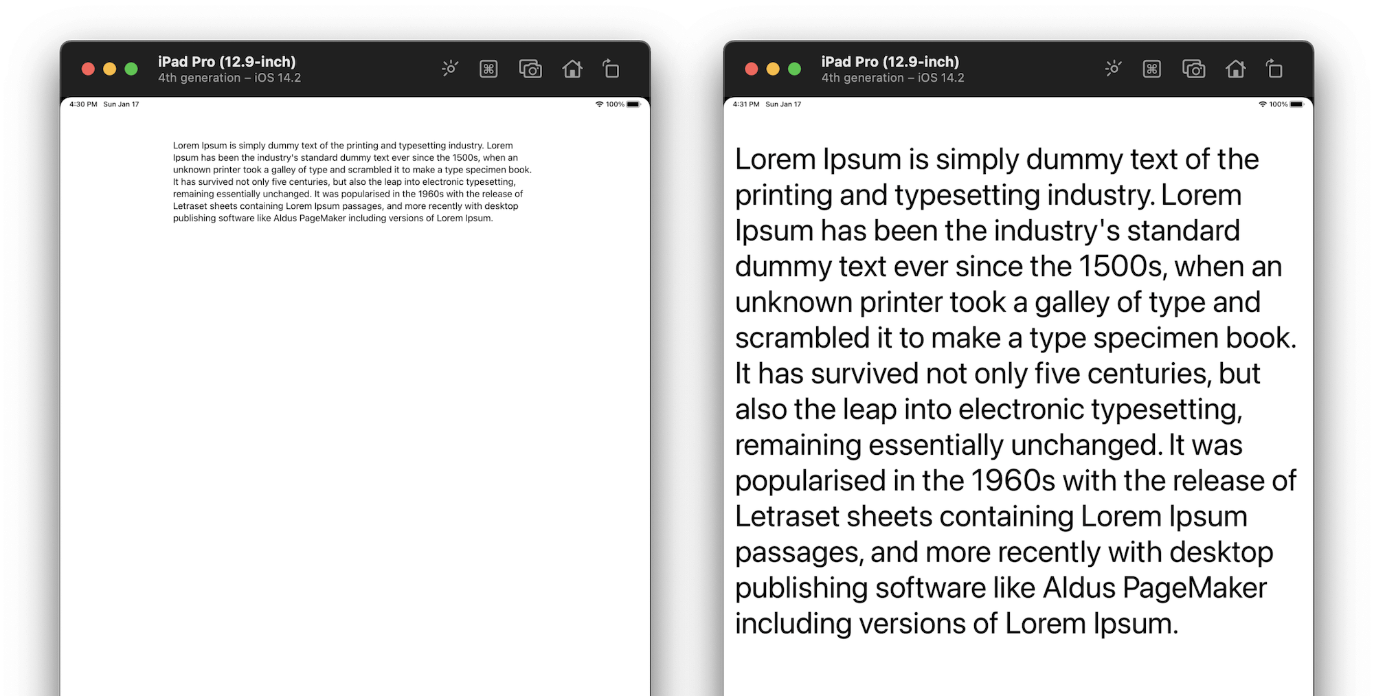
SwiftUI is more friendly - provides Dynamic Type out of the box:
// .body style - the default
Image(systemName: "bookmark")
Text("Interesting article")

Image(systemName: "bookmark").font(.largeTitle)
Text("Interesting article").font(.largeTitle)
- This is more useful for iPads, and since they are gaining popularity these days by far, so more apps will adapt UI for new realities, we need to talk about it a bit.
Readable Content Guide - our next fellow, a layout guide defines an area that can easily be read without forcing users to move their head to track the lines.
The width of readable area changes according to user’s preferred content size.
let guide = view.readableContentGuide
label.topAnchor.constraint(equalTo: guide.topAnchor).isActive = true
label.leftAnchor.constraint(equalTo: guide.leftAnchor).isActive = true
label.rightAnchor.constraint(equalTo: guide.rightAnchor).isActive = true
p.s. I haven’t found a similar API in SwiftUI, except padding with different values. So would appreciate if you tell me how to configure it right.
- In iOS 13 UIKit kicks off a prediction for initial traits of a view. UIKit guesses the likely traits for the view based on the context. So if you relied that
traitCollectionDidChangewill be called when a view is first added to the view hierarchy, it’s not always true anymore. You can read the detailed article here.
let vew = UIView()
print(customVew.traitCollection.preferredContentSizeCategory) // iOS 12 - Unspecified
print(customVew.traitCollection.preferredContentSizeCategory) // iOS 13+ - AccessibilityXXL
My point is to have a properly configured view in both places. Depends on iOS version it’ll work different. So be aware of it!
- Using
automaticDimensionwithout any doubt is a good friend for Dynamic Type. It’s required settingestimatedRowHeightwhen usingautomaticDimensionas well and we can improve performance by passing a dynamic value instead of a static one.
tableView.rowHeight = UITableView.automaticDimension
tableView.estimatedRowHeight = UIFontMetrics.default.scaledValue(for: 50)
- It would seem obvious, but worth mention that using Stack View simplifies a lot in some cases. If you’re building a simple setting menu, stack view will help out you by far.
override func traitCollectionDidChange(_ previousTraitCollection: UITraitCollection?) {
    super.traitCollectionDidChange(previousTraitCollection)

    if traitCollection.preferredContentSizeCategory.isAccessibilityCategory {
        stackView.axis = .vertical
    } else {
        stackView.axis = .horizontal
    }
}
struct ContentView: View {
    var body: some View {
        Group {
            if sizeCategory.isAccessibilityCategory {
                VStack { ... }
            } else {
                HStack { ... }
            }
        }
    }
}
- Also worth mentioning a property wrapper that was released during WWDC20 -
ScaledMetric. It allows you to scale a number according to the size category chosen by a user.
struct ContentView: View {
    @ScaledMetric(relativeTo: .body) var spacing: CGFloat = 10
var body: some View { VStack(spacing: spacing) { (elements) } } }
- At the end I will ask you to pay attention to the first example one more time. We can distinctly see the thick separators on the second picture. And because it’s enough a common practice implementing custom separators on our side, a developer needs to keep in mind the native behaviour.
Debugging or how to make your life easier
Testing Dynamic Type can be a time-consuming process for sure - switching between Settings app for changing the font size and your app… As a result spending a lot of time to this is not what you’re planning to achieve. So let’s cover a few much simple ways of changing the font size on the fly.
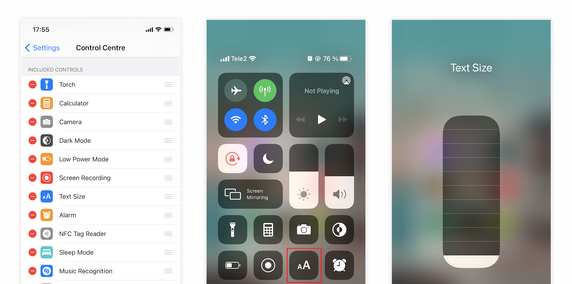
Control Centre
This is a way you need when developing on a real device. Just add “Text Size” option in Control Centre. Make sure the Larger Accessibility Sizes switcher is enabled: Setting > Accessibility > Display & Text Size > Larger Text.
For super-duper optimization fellows, try creating a shortcut for setting a needed text size and invoke it by triple or double tap action on a back of your phone.
- Create shortcut in Shortcut app
- Use it in accessibility menu of Back Tap: Settings > Accessibility > Touch > Back Tap (at the bottom) > Double / Triple Tap > (Created Shortut)

Accessibility Inspector
The old best friend located at Xcode > Open Developer Tool. Great to know you not only can change this settings for the Simulator, but also for any connected iOS device

Xcode
Xcode makes it easier overriding these settings directly from debugger and I hope everyone has already had time to get to know this.

SwiftUI
At the end it’s quite simple to set environment for different previews and see multiple results in a row. But this approach will suit for real lucky mans, who already use SwiftUI in production. 😉
struct ContentView_Previews: PreviewProvider {
   static var previews: some View {
      Group {
         ContentView().environment(\.sizeCategory, .extraSmall)
         ContentView().environment(\.sizeCategory, .accessibilityLarge)
      }
   }
}
I hope this was worth reading article for you! Dynamic Type is our good friend and we shouldn’t forget it.
© 2024 Nikita Ermolenko. Some rights reserved.